When it comes to choosing the perfect white paint color, there are plenty of great choices to pick from. There are other things to consider as well before painting your home. Lighting, undertones and paint finish all play an important role in the final look. If you’ve been trying to decide on the perfect white color, I’ll go over Simply White vs. Chantilly Lace Benjamin Moore Paint, and how to pick the perfect color.
This post may contain affiliate links.
Simply White Vs. Chantilly Lace Benjamin Moore Paint: Choosing The Perfect White Paint
I am currently planning to paint my home and deciding on the perfect neutral white to do the job. My top two contenders are Benjamin Moore’s Simply White and BM Chantilly Lace. These are two of Benjamin Moore’s most popular white paint colors. I think they would be the best white paint colors for my house, but each home is different.
When weighing my options, I have to think about the lighting in my home. Light reflective value, which refers to the percentage of light a paint color reflects, determines how the colors will show up in my home. The room orientation as well as north, south, east and west lighting also affect how the undertones will appear. Natural lighting and artificial light make a vast difference in how the paint shows up too.
I want to make sure the undertones of the paint convey a comfortable, calming and relaxing mood in my home. I want them to match my other paint colors as well. Another decision I will have to make is the finish of the paint that is best to use depending on what areas of my home I am painting.
How To Pick The Perfect White Paint Color
The perfect white paint color is different for each home. A good place to start is the natural and artificial lighting in your home. Undertones in the white paint colors will look different depending on where the sun rises and sets in your rooms so it is important to assess the lighting in your home before choosing your favorite white color.
Assess Your Lighting In Your Home
Lighting plays an important role in how you perceive paint colors. LRV, or light reflectance value, refers to the percentage of light a paint color reflects. A value of 0 is the darkest black and a value of 100 is the truest white color.
Consider Room Orientation
Room orientation also affects the way paint is perceived. Northern light can wash out some paint colors. To counteract the cool tones of north-facing rooms, paint with warm undertones will create balance. Cool colors can add nice accents, but will double the effect of the lighting.
North facing rooms rely heavily on paint color and lighting to feel warm and inviting, but south facing rooms receive plenty of natural lighting throughout the day to do this. With that said, time of day makes a difference in how the natural light affects your paint color. Southern light tends to have warm tones. Your paint will look different at noon time versus late afternoon. The best way to decide which is the right white paint color for you in this situation is to stick a few paint samples on the wall and look at them during different times of the day. This way you can find which feels most balanced for your own home.
Eastern and western facing rooms are a bit trickier to work with because the sun doesn’t rise on one side of the room and set on the other. They will always have partial sunlight. This makes picking a paint color more challenging. You may notice shadows in an east-facing room in the morning. The morning light is slightly warm in these rooms. However, it will turn colder as afternoon light begins to hit it. Warm tones may help to balance this out.
Finally, a western facing room, similar to an eastern facing one can prove a challenge when it comes to paint tones. In the morning, gray undertones are prominent. When the sun is brightest, at noon, the light tends to wash out the colors. As afternoon light seeps in, a golden glow will warm up the room.
Artificial vs. Natural Lighting
Natural light only comes from the sun, but artificial light can come from many sources within your home. These sources are ones you have control over and should consider especially in rooms that don’t get much direct sunlight.
It is important to use the right kind of light bulb for the ambiance you are looking to create. Incandescent intensifies warm colors with the bright yellow light it gives off. Because of this, cooler colors become washed out. Fluorescent bulbs are cooler in comparison and enhance blue undertones and green undertones. Halogen lights are most similar to natural lighting, so they don’t affect the way colors appear as much as incandescent and fluorescent bulbs do. If you don’t get much light and use artificial sources, think about how these may change the look of your white walls throughout your whole house.
Match Your Undertones
There are three kinds of colors: warm, cool and neutral. Warm colors like red, orange and yellow, bring energy and positivity into a room. Cool colors like green, blue and purple, provide a space with a sense of calmness and relaxation.
Neutral colors such as white and gray can lean toward warm, cool, or neutral depending upon their undertones.
The undertone plays a significant role in the feel of the room. Warm undertones create intimate and cozy spaces. They are associated with energy, playfulness and happiness. Warm colors are often used in kitchens and living rooms. They make larger spaces feel more inviting.
Cool undertones convey a sleek and soothing feel. They promote calm, relaxation and a fresh look. They are popular in bathrooms and bedrooms and make smaller spaces feel more expansive.
Benjamin Moore Simply White and Benjamin Moore Chantilly Lace have different undertones. Simply White has a warm undertone, while Chantilly Lace has a neutral undertone. That is something to consider when deciding which shade will look best in your home.
Pay Attention To Your Paint Finish
There are several paint finishes to consider once you’ve narrowed down paint colors and undertones. They include flat, matte, eggshell, pearl, satin, semi-gloss and high-gloss. These seven finishes, or sheens, are a measure of how much light reflects off the surface, resulting in a gloss.
Flat
- No Gloss
- Does not reflect light
- Has no sheen resulting in more pigment coming through
- Does not clean easily and can result in burnishing
- Commonly used on ceilings, walls, low traffic spaces
Matte
- Similar to flat but a bit more forgiving and more easily able to clean
- Provides luxurious deep colors
- Commonly used on living room, dining rooms, bedrooms
Eggshell
- Provides low sheen and soft smooth “eggshell” finish
- Better washability in comparison to flat paint
- Commonly found in high traffic areas: living rooms, bedrooms, kitchen
Pearl or Satin
- Medium gloss
- Highly durable
- Easy to clean
- Commonly found in high traffic areas indoors: walls, trim, doors, and cabinets
- Can be used outdoors on siding, trim, shutters, and doors
Semi-Gloss
- Extremely durable
- Easy to clean
- Creates smooth finish and great at showcasing dimensions
- Commonly used on trim, doors, cabinets, wainscoting
- Can be used outdoors on trim, shutters
High Gloss
- Reflects light, creates depth and clarity
- Mirror-like appearance
- Commonly used indoors on trim, doors, cabinets
- Can be used outside on architectural detailing
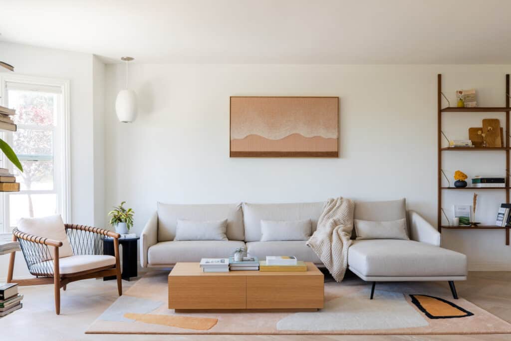
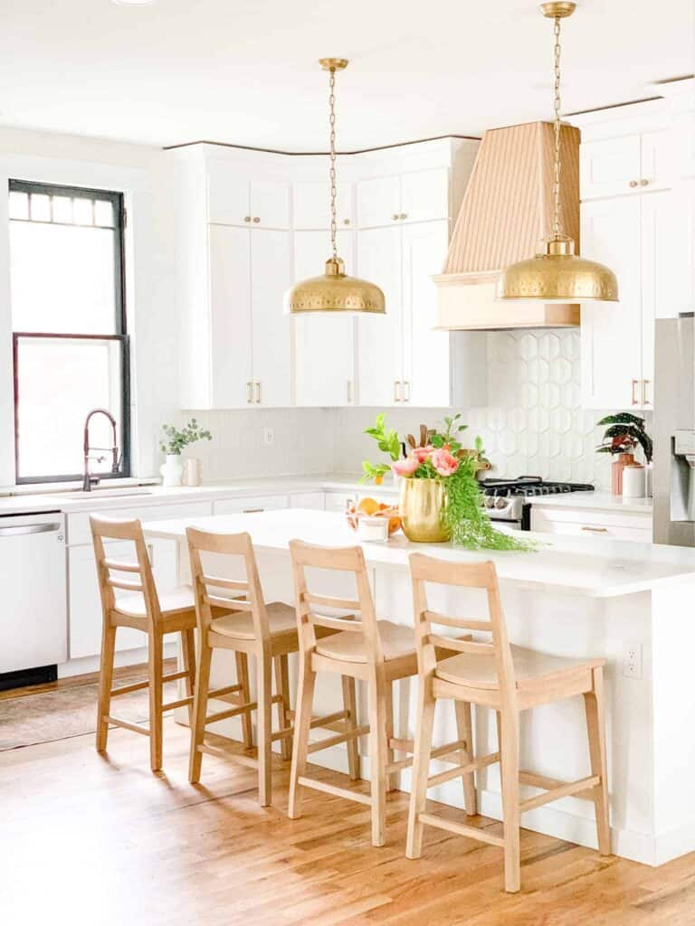
Benjamin Moore Simply White
I will be discussing my two favorite white colors in depth here, explaining the undertones and considerations under different lighting circumstances.
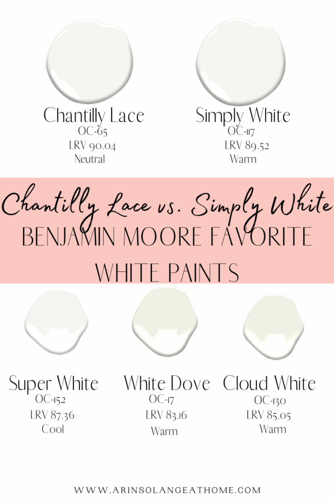
Benjamin Moore’s Simply White paint, also referred to as OC-117, is one of the company’s warm white colors. It was the 2016 Benjamin Moore Color of the Year and remains one of the most popular whites among homeowners. The LRV, or light reflective value, is 89.52 on a scale of 0 being fully black to 100 being completely white.
Simply White Undertones
Simply White has slightly warm undertones. It doesn’t pull much yellow in natural lighting, but it is an off-white shade. With warm lighting, this will be more visible.
Simply White Under Different Lighting Circumstances
White paints, more than other colors, change depending on lighting circumstances. In bright natural light, Simply White will appear a bright white color. East lighting will bring in a lot of natural light and Simply White will appear brighter and more white with less yellow undertones. As the sun begins to set, some yellow will show through with subtle undertones.
Northwest lighting will bring out some yellow undertones of Simply White paint, but not as much as warm lighting would. This warmer color would not look like a cream. In northern lighting, it will look like a true warm white.
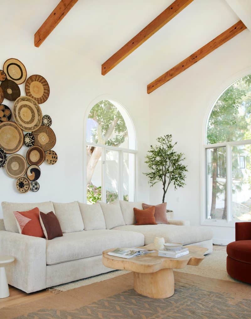
Benjamin Moore Chantilly Lace
Benjamin Moore’s Chantilly Lace OC-65 is one of the company’s neutral white colors. The LRV of Chantilly Lace paint, or light reflective value, is 90.04 on a scale of 0 being fully black to 100 being completely white. As far as Benjamin Moore paint colors, Chantilly Lace is their brightest white paint. Sherwin Williams does have whiter white colors. A stark white look isn’t what I want in my home so I’ll go into detail on the undertones Chantilly Lace has and how it looks under different lighting circumstances.
Chantilly Lace Undertones
Chantilly Lace is a clean white and has neutral undertones, making it a versatile color. That means lighting plays a major role in what colors it picks up. Chantilly Lace has minimal undertones which means it acts mostly like a pure white and has a clean look.
Chantilly Lace Under Different Lighting Circumstances
If you have northern light, it may show a little bit blue or gray. Southern light, or even western afternoon light, may lean somewhat warm.
Other Similar White Paint Colors
Some other similar great colors include White Dove, Super White and Cloud White. I’ll discuss the undertones and lighting considerations below.
Benjamin Moore White Dove
Benjamin Moore White Dove, OC-17, is a clean and classic white. It is in the Benjamin Moore Off White collection. It is a warm white paint color with a yellow undertone.
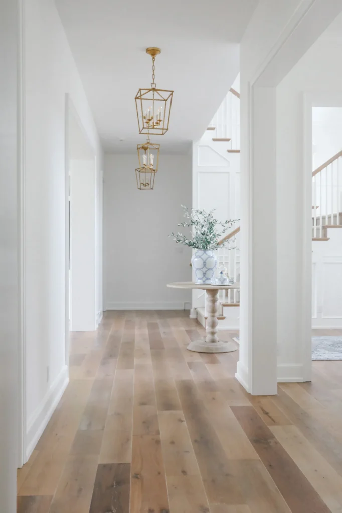
This hallway is crisp and bright thanks to Simply White by Benjamin Moore.
Benjamin Moore Super White
Benjamin Moore Super White, OC-152, is a bright white paint color. It is in the Off White collection as well. It is a very slightly cool white paint color that reflects color very well.
Benjamin Moore Cloud White
Benjamin Moore Cloud White, OC-130, is a soft and balanced shade of white. It can be found in the Off White collection. It is a creamy white color. Depending upon the lighting, it can appear more yellow at times.
Other Posts You’ll Love
Best Coastal Living Room Paint Colors | Best Paint Finish Dining Room | Best Paint Sprayer For Walls
Pin This Photo Below For Later
I hope this post has given you some helpful suggestions to consider when picking the perfect paint color for your house. Each of these shades of white would be an excellent choice – they are tried and true with slight differences. I know that with these tips in mind, you will make the best choice for your home. Be sure to pin the photo below for later, and if you don’t already – follow me on Instagram (@arinsolange) and Tik Tok (@arinsolange) for more fun.